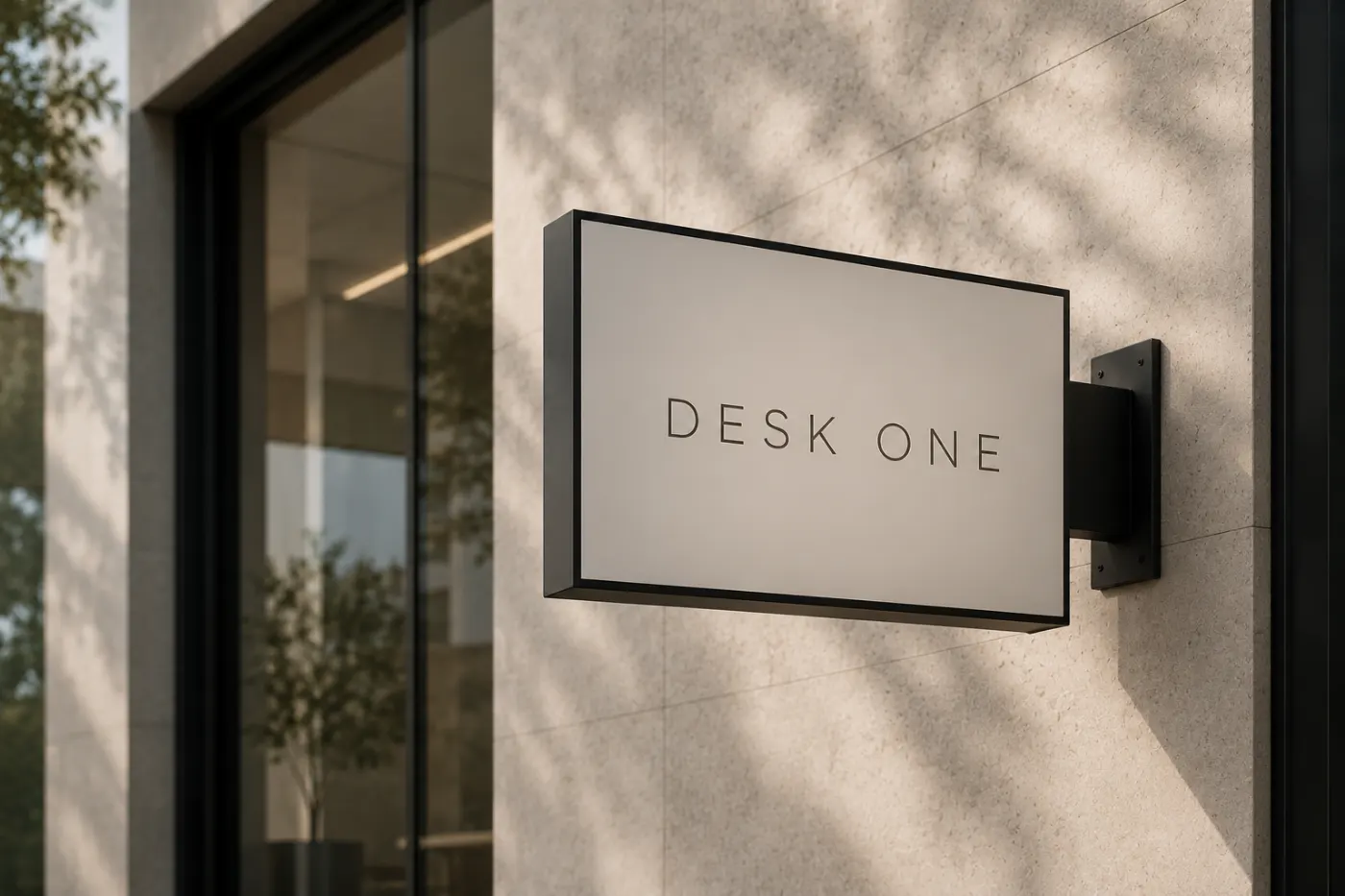
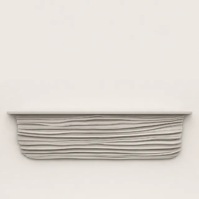
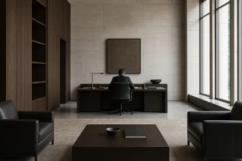
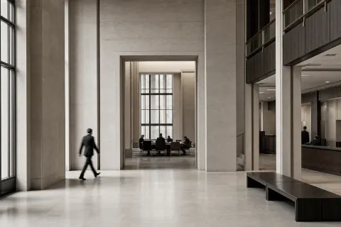
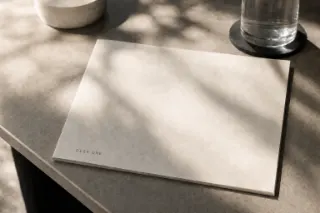
Before a mark, a palette or a face existed, this was the only picture of what Desk One should look like — made to settle the REGISTER, not the identity. Limestone rather than glass, one name and nothing else on the panel, the lettering small on a face that stays mostly empty. Everything the rest of this document walks through was judged against it, and none of it is in here: the style, the mark and both faces all had to be found. What follows is the finding, in the order it happened.The first picture of the register: limestone, one name, lettering small on a face that stays empty. Everything after was judged against it.
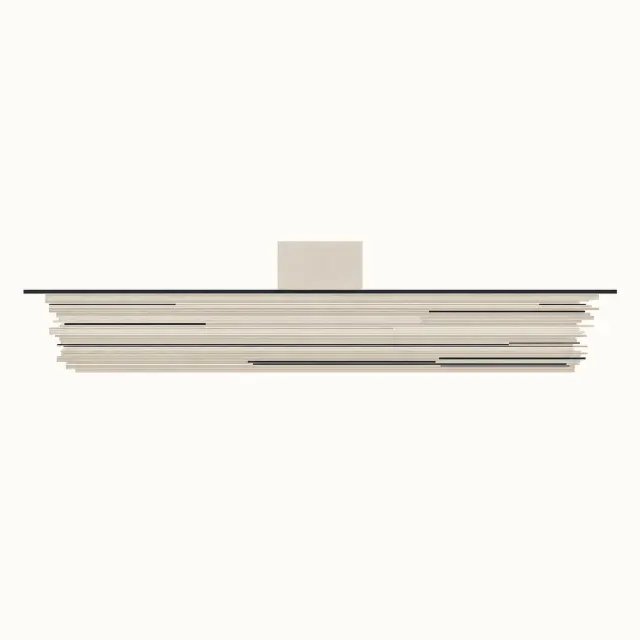
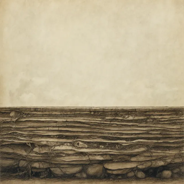
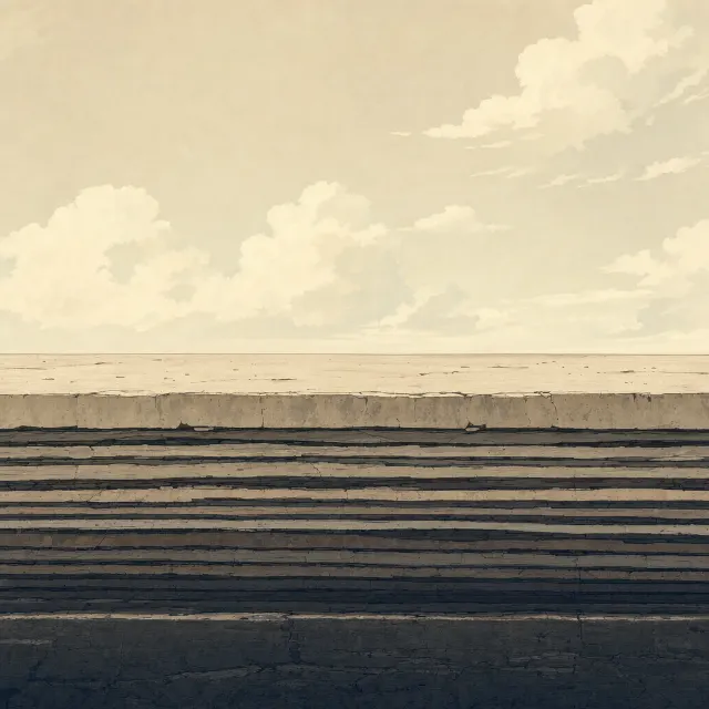
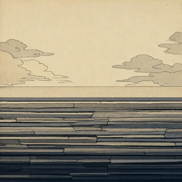
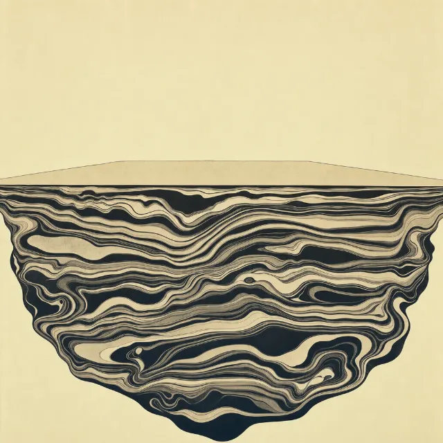
One subject — a level plane with the work banked beneath it — rendered nine times in nine aesthetics chosen to be nothing like each other. Picking a favourite was never the point: a house style never compared to anything is a preference, and a preference cannot be handed to the next render or the next person. The Swiss International frame won on the brief’s own anti-list, and that exact file is now the style reference every image in the manual is generated through — not a description of it, the frame itself.One subject in nine aesthetics. The frame that won is the style reference every image in the manual is still generated through.
Rooms, and then materials
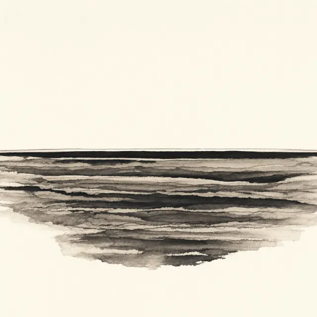
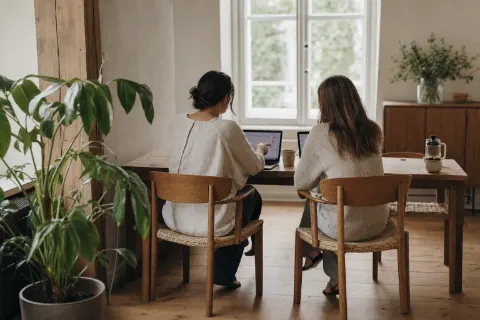
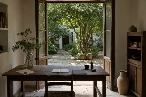
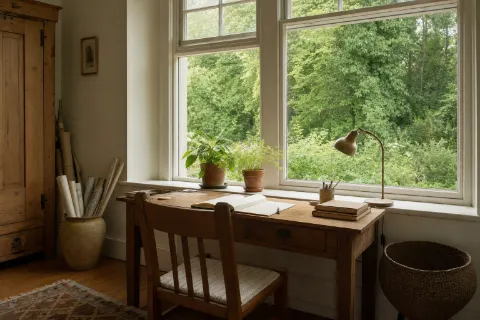
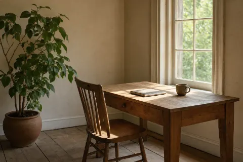
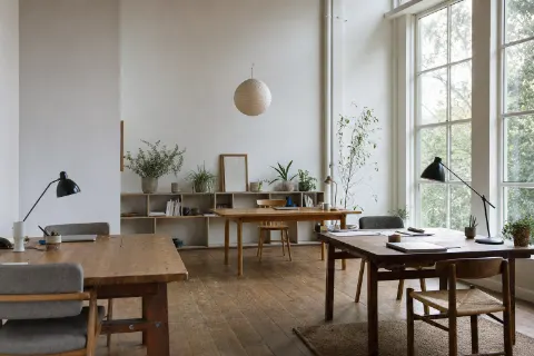
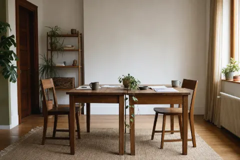
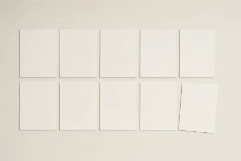
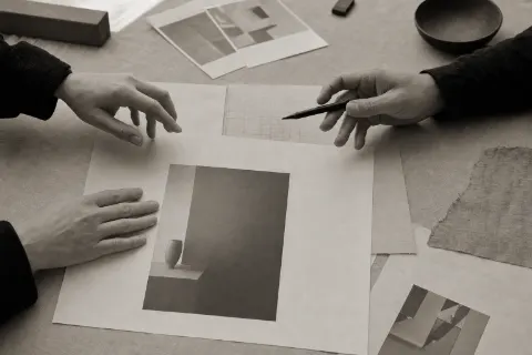
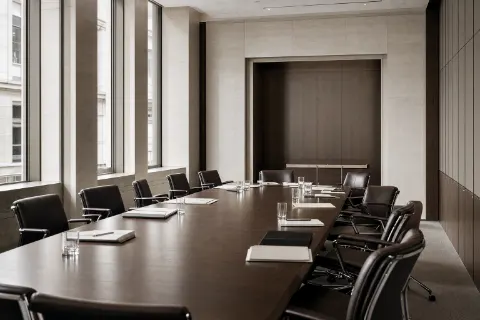
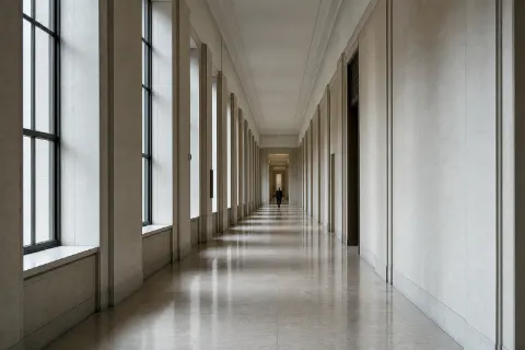
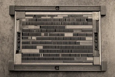
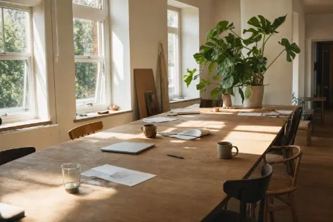
Twenty-one moods for the opening tapestry, and nearly every one is a ROOM — desks, corridors, meeting tables, people mid-work. One at a time each is a good photograph. Read all at once they say what the firm is LIKE and never once say whose manual this is, and a warm room with good light is what every consultancy on earth already shows. The sheets of blank paper are the only ones that pointed anywhere: not a room, but the material the work is done ON. So the subject changed rather than the craft — blank sheets, a record edge on, a machine old enough to have been used, an archive of what was finished — and architecture survives as surface and light, never as the thing being photographed.Twenty-one moods, nearly all of them rooms — which is what every consultancy already shows. Only the blank sheets pointed anywhere, and the subject became materials.
Fourteen ways to draw it
Anton StankowskiDeutsche Bank, 1974Otl AicherMunich 1972 pictograms, LufthansaWim CrouwelStedelijk Museum, New AlphabetMassimo VignelliNYC Subway, American Airlines, KnollJosef Müller-BrockmannSwiss objective design, Zürich Tonhalle postersPaul RandIBM, UPS, ABC, NeXTSaul BassAT&T, Continental, United WayMilton GlaserI♥NY, Brooklyn BreweryPaula ScherPublic Theater, Citi, WindowsLance WymanMexico 68, Washington MetroYusaku KamekuraTokyo 1964 OlympicsIkko TanakaNihon Buyo, Muji art directionChermayeff & GeismarChase, Mobil, NBC, PBSExperimental JetsetWhitney Museum responsive W, Helvetica-only rationalism
Before the mark was drawn it was commissioned fourteen times — one prompt per named working method, each given the figure and asked to take it their own way. They came back near-identical, and that is the finding rather than the failure: an exact figure plus a style instruction returns the figure. A set whose job is departure cannot be handed the thing to copy.Fourteen working methods, one prompt each. They came back near-identical: an exact figure plus a style instruction returns the figure.
The same fourteen, off the leash
Colour, material and edge freed · the figure still binding
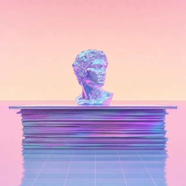
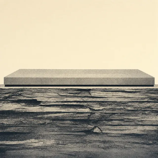
If handing over the figure returns the figure, then the answer looks like less leash — so the same fourteen were run twice more. The first round held the figure and freed colour, material, texture and edge. The second stated the figure only as ANCESTRY and asked for a descendant. A round between them is missing from this page, and it is the one that taught the most: asked for freedom with nothing named but the abstract construction — a level form, mass beneath — the asymmetry died in almost every render and eight of fourteen reached for navy, the private-equity convention the brief refuses by name. A symmetrical plinth satisfies “a level form with mass beneath” perfectly. Its frames are gone, overwritten by the round that replaced them, and the finding survives because it went into the prompt: the second band above refuses both attractors by name, which is the only reason it is warm and leaning right all the way across. Freedom has attractors, and they are measured and written down, never spotted by taste.The same fourteen, twice more, with the leash longer each time. Freedom has attractors — a symmetrical plinth, navy eight times in fourteen — and they only came out once the prompt refused them by name.
What it taught
Wim Crouwelasked for the ONEMassimo Vignelliasked for the ONEChermayeff & Geismarasked for the ONEDrawnand then set asideCutthe mark as it stands
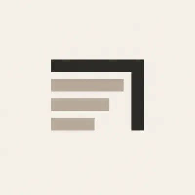
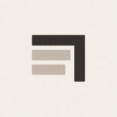
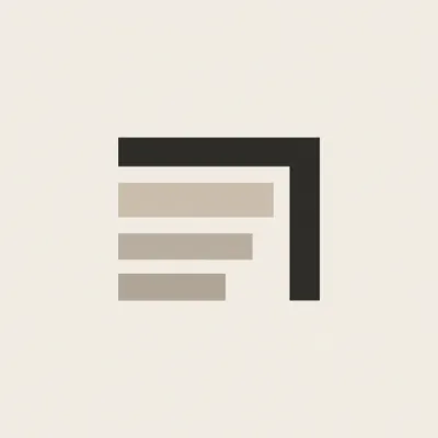
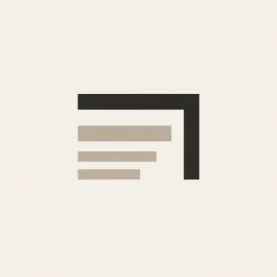
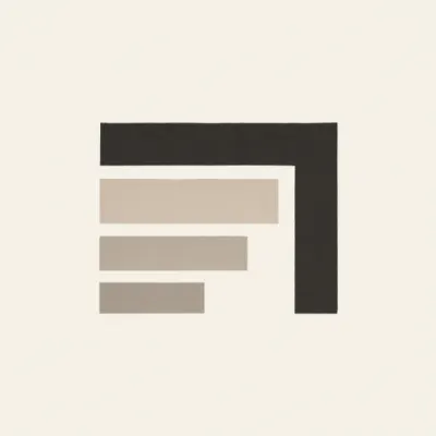
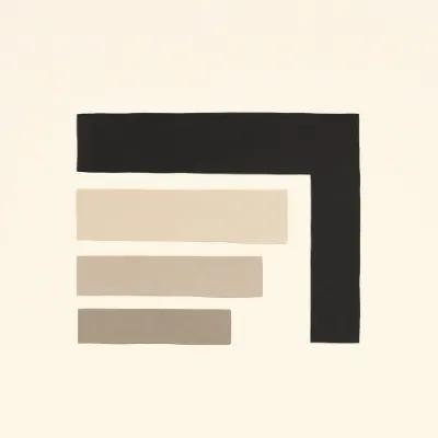
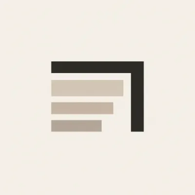
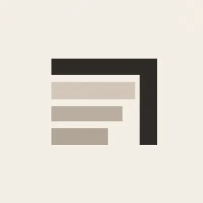
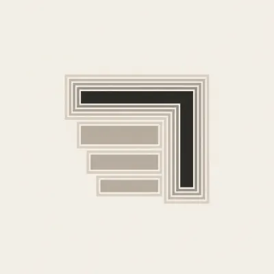
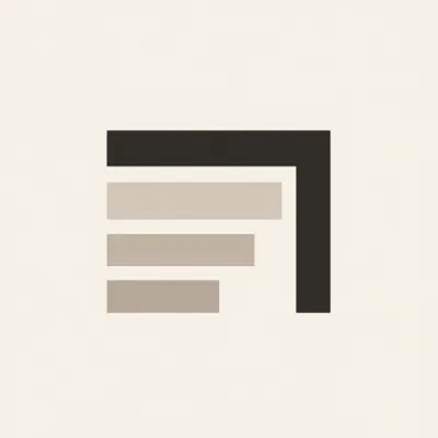
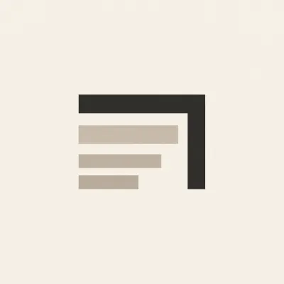
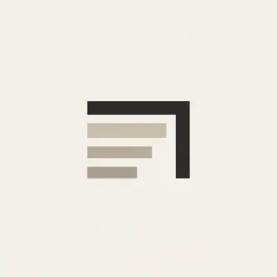
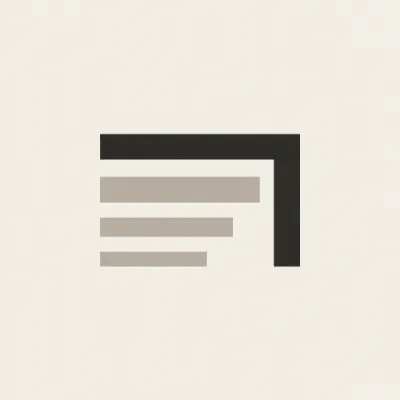
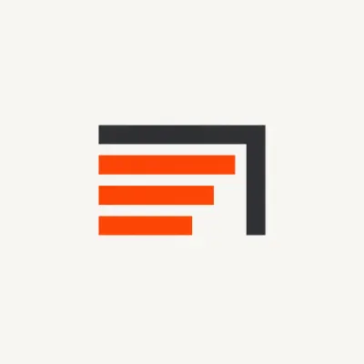
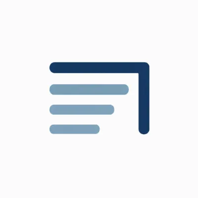
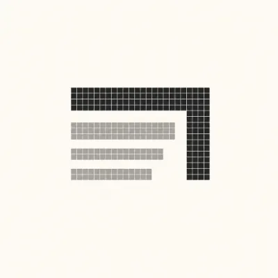
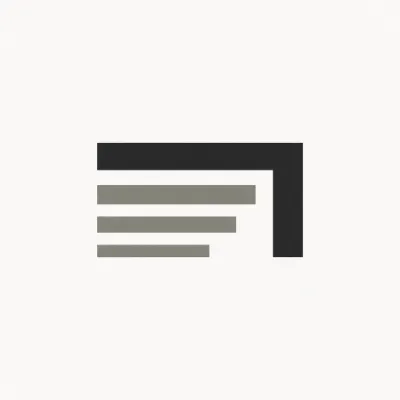
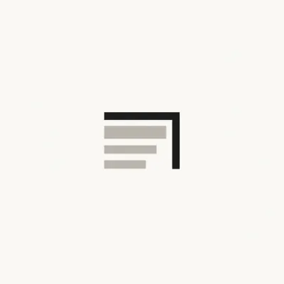
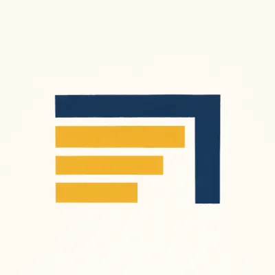
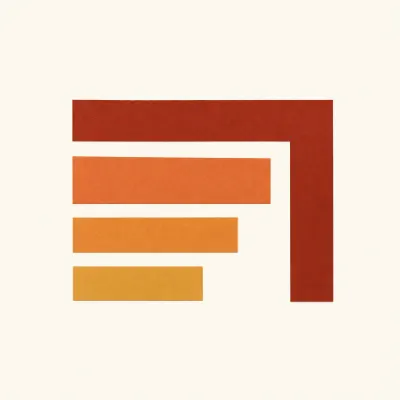
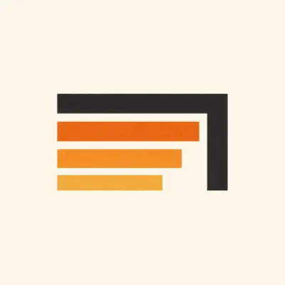
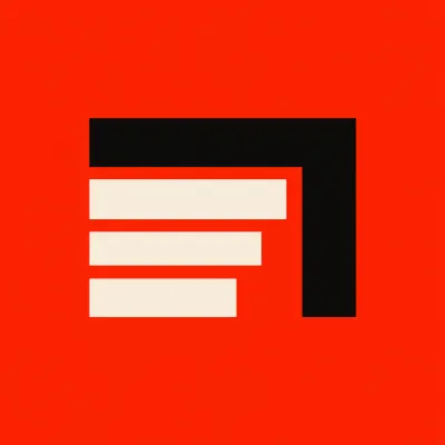
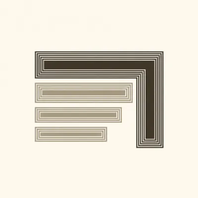
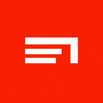
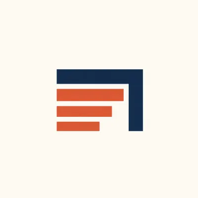
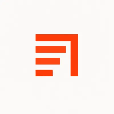
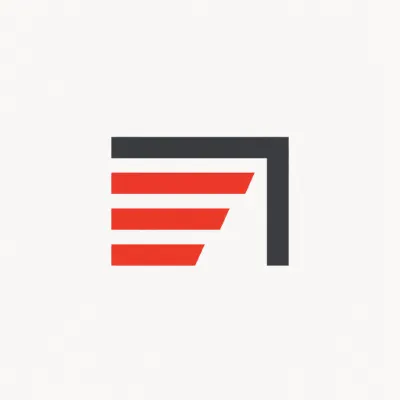
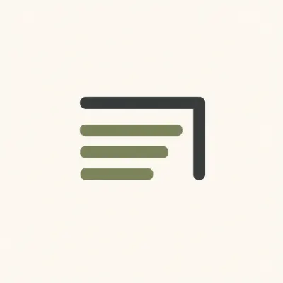
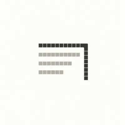
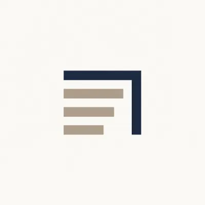
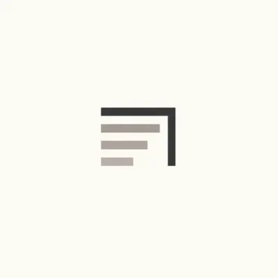
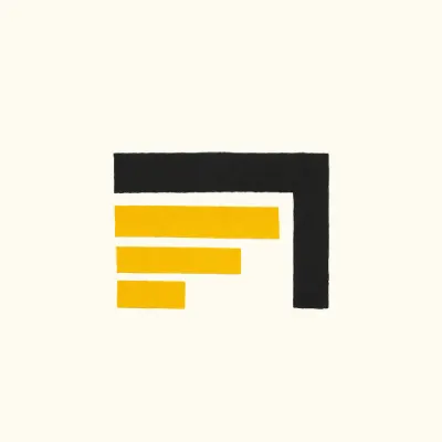
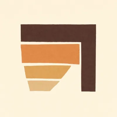
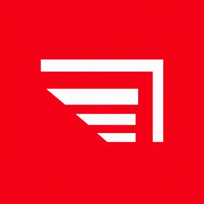
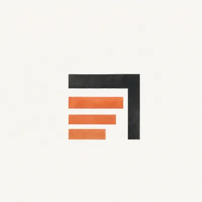
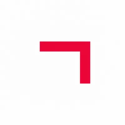
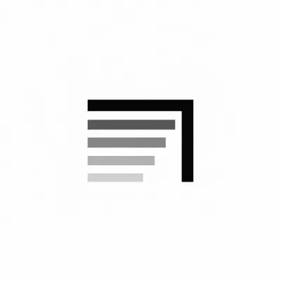
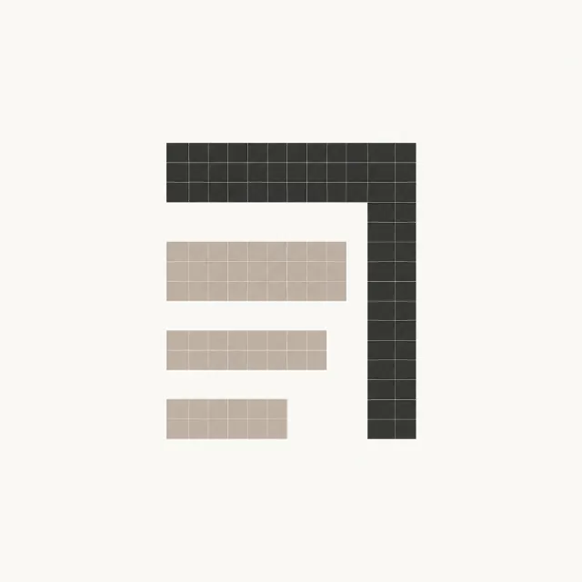
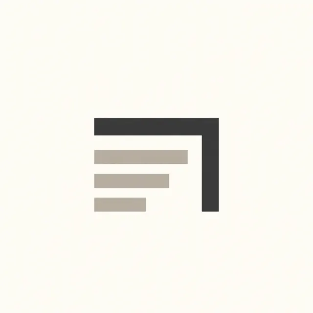
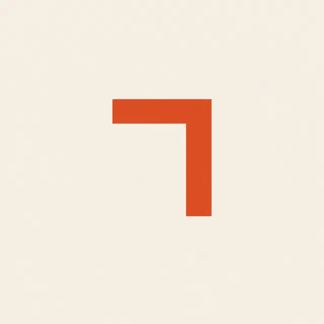
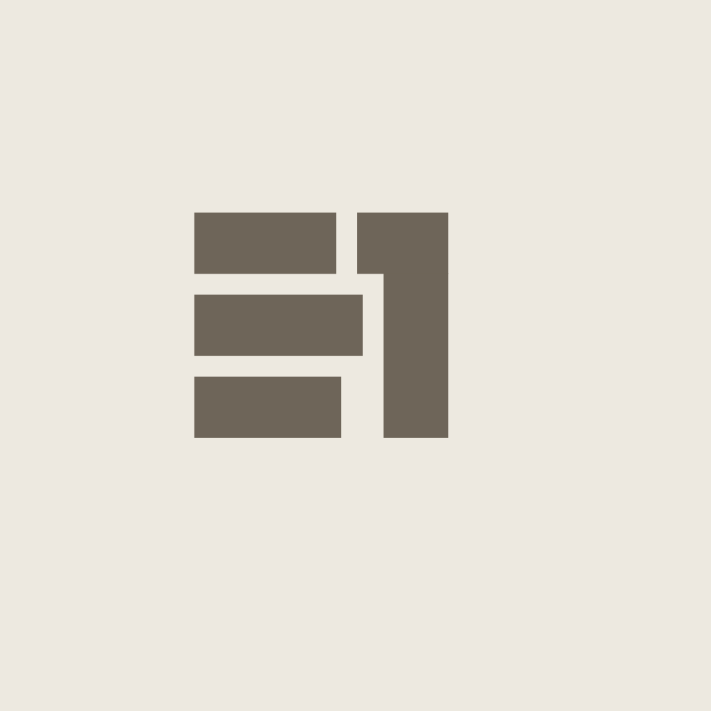
Three methods were run again at the numeral alone, and between them they show why none of the fourteen got there: keep the mass banked under the rule and the figure stays a shelf, take the mass away and the same bracket reads as a one. The answer was latent in the figure rather than missing from it — join the top row and it reads as a desk and as a one at once. That figure is the fourth tile, and it is not the mark. Beside the logotype it was blocky where the word is fine, and constructed where the word is drawn: a competent symbol from another identity. Nothing in a fan-out could have caught that, because every prompt in it was composed against the figure itself. What corrected it was the smallest question in the manual — what does this have to sit next to — and the answer was already in the word. The mark is the logotype’s own O with one line run through it.The fourteen never got there, and the figure that did is the fourth tile — right by every measure the method could take, and wrong beside the word. The mark is the logotype’s own O with a line through it.
The square it was drawn for
163248
The manual settles the symbol in one sentence — DESK ONE at 0.26em is four grey smudges at 32 px, and a favicon, an avatar and an app icon are all squares. This is what came out: the shipped files, magnified to their own pixel grid and then printed at the size they are actually seen at. Below 48 the mark is a SECOND drawing, and it has to be — the letter’s stroke is a sixteenth of its own diameter, which is three quarters of one pixel at sixteen, so the ring greys out before it closes. The small cut is the same two fractions on a grid where one unit is one pixel: the letter is 12 of 16 and the line crosses on row 8, exactly rather than approximately, with the stroke rounded up to a whole two. That is what the display cut’s numbers were rounded TO. The build rasters through the same headless browser every sheet here is checked with, then audits its own pixels — the LINE is straight and is held to pure ink across its own rows, and the curve’s softness is printed rather than asserted, because no renderer holds a circle to zero antialiased pixels and a check that demanded it would only ever be rigged.The shipped icons on their own pixel grid, and at the size they are seen at. Below 48 the mark is a second drawing — the same two fractions on a grid where one unit is one pixel.
The faces we read
Read
Elms Sans · Source Serif 4 · Newsreader · Lora · Inter
Chosen
Lora, on how little it asks to be noticed
Refused
the mark’s own face, which cannot carry a paragraph
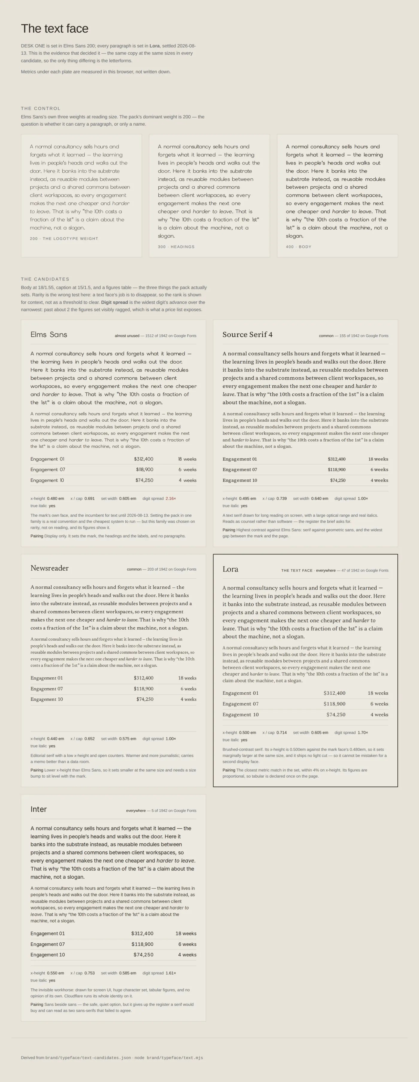
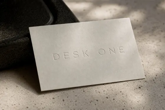
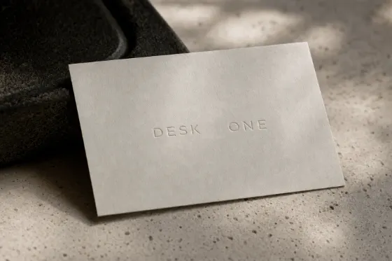
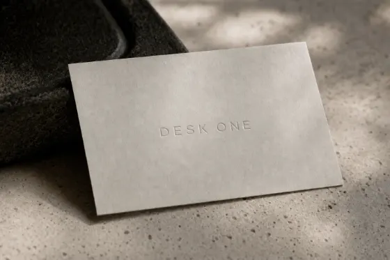
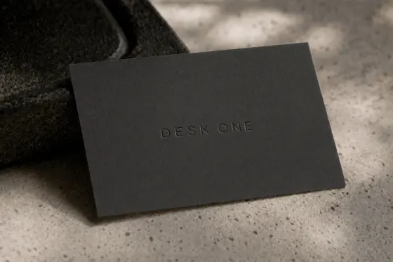
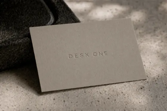
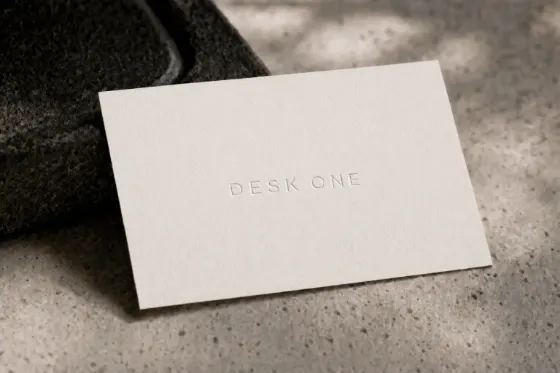
The last thing made, and the method in one row. Every other sheet here is a SET — the same question asked of fourteen methods or nine aesthetics at once. This is a chain: each frame is the one before it with a single thing moved, because the tool feeds the current version back in rather than starting again. One stone, one cloth, one light, one angle, held all the way across, so what the row compares is the CARD and not six photographs of a card. Stone, then charcoal, then limestone, then bone. Re-rolling the prompt six times would have produced six good pictures and settled nothing, which is the difference between generating images and deciding something with them.Six versions of one card, each the one before it with a single thing moved. One stone, one cloth, one light — so the row compares the card, not the photographs.
And ten more objects
badge
deck
folder
glass
letterhead
notebook
plaque
stamp
envelope
screen
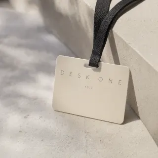
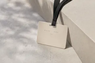
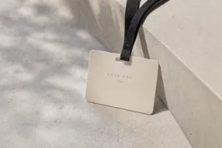
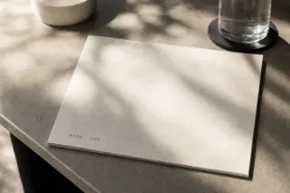
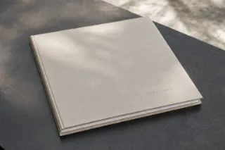
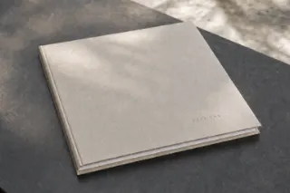
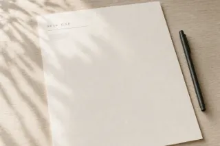
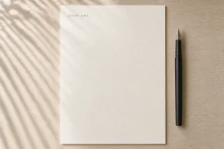
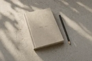
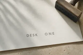
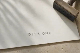
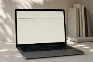
Every other object the mark was put on, each with its own chain: down a column is one object being resolved, across a row is all of them at the same pass. Two have a single frame because they were right first time — the sheet shows what was made rather than a tidy grid. And the lettering in these is the MODEL’S, not ours, which is exactly why they are rounds and not artwork: an image model draws something that looks like our type and is not it. The marked columns are the ones that went on to the step that fixes it — the drawn lettering stripped off the photograph and live type laid onto its plane, in perspective, taking the material’s own weave with it. Those are what the manual prints. The rest stopped here, and that is the whole difference between the objects on this page and the objects in the book.Every other object the mark was put on. The lettering in these is the model’s — the marked ones went on to have real type laid onto the plane.



 badge
badge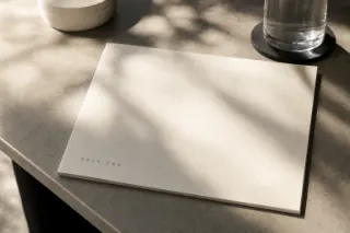
 deck
deck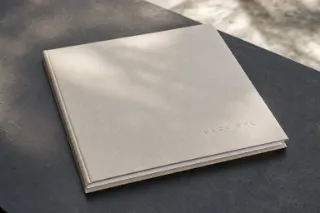
 folder
 glass
glass
 letterhead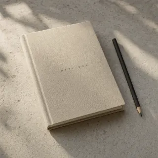
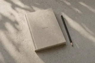 notebook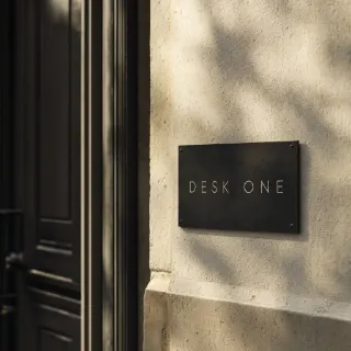
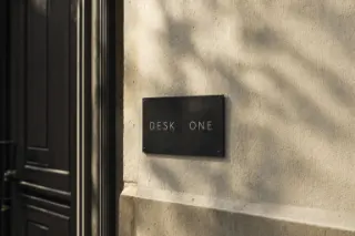
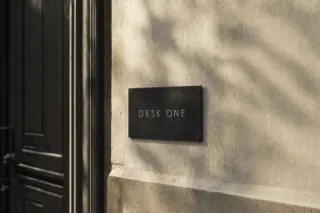 plaque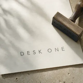
 stamp
stamp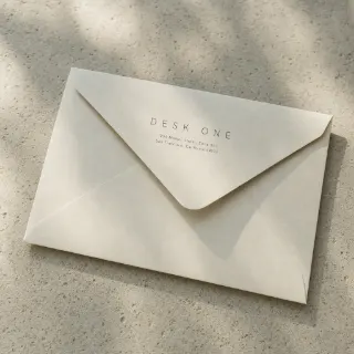 envelope
 screen