Brand · August 2026 ·
Real materials, our own work standing in them, and the identity flat. Objects chosen for what they are, never for when they are from. Nothing rendered, nothing staged.
Elms Sans ExtraLight, tracked wide. A new typeface, from Gida Type Studio. Nobody else is using it yet.Elms Sans ExtraLight, tracked wide. A new typeface, from Gida Type Studio. Nobody else is using it yet.
DESK ONEOne lockup, and it is this one. Theirs first and left, ours second, both at the same cap height. There is no endorsement stack, no ours-underneath, and no version where one mark is smaller. Written out it is the same form: Company X at Desk One.One lockup, and it is this one. Theirs first, ours second, both at the same cap height. Written out: Company X at Desk One.
The wordmark is the identity, and this is not a second one. It exists for one reason: a square is the one shape DESK ONE cannot go in. Everywhere a word fits, the word is what goes there — nothing in this identity is built on the symbol, and nothing needs it.
Paper, stone and ink — the colours of a quiet room and a well-used desk. Warm rather than clinical, and not one of them raising its voice. Most of what we make is the palest one, because the space is the thing we are actually selling. There is no accent colour, and there is not going to be one: the work should be the brightest thing on the page.Paper, stone and ink — the colours of a quiet room. Mostly the palest one, because the space is the point. No accent colour, and there will not be one.
The quick brown fox jumps over the lazy dog
Lorem ipsum dolor sit
Consectetur adipiscing elit sed do
Eiusmod tempor incididunt ut labore
Lorem ipsum · Dolor sit amet · MMXXVI
Lorem ipsum dolor sit amet, consectetur adipiscing elit, sed do eiusmod tempor incididunt ut labore et dolore magna aliqua. Ut enim ad minim veniam, quis nostrud exercitation ullamco laboris nisi ut aliquip ex ea commodo.
Duis aute irure dolor in reprehenderit in voluptate velit esse cillum dolore eu fugiat nulla pariatur. Excepteur sint occaecat cupidatat non proident, sunt in culpa qui officia deserunt mollit anim id est.
Neque porro quisquam est qui dolorem ipsum quia dolor sit amet.
Sed ut perspiciatis unde omnis iste natus error sit voluptatem accusantium doloremque laudantium, totam rem aperiam, eaque ipsa quae ab illo inventore veritatis et quasi architecto beatae vitae dicta sunt explicabo.
At vero eos et accusamus et iusto odio dignissimos ducimus qui blanditiis praesentium voluptatum deleniti atque corrupti quos dolores et quas molestias excepturi sint occaecati cupiditate non provident, similique sunt in culpa.
Ut enim ad minima veniam, quis nostrum exercitationem:
Figures are tabular, so a column of them lines up: 1,240, £300,000, 2026. Links take the ink of the text around them — desk.one — never a colour of their own.
Nemo enim ipsam voluptatem quia voluptas sit aspernatur aut odit aut fugit, sed quia consequuntur magni dolores eos qui ratione voluptatem sequi nesciunt, neque porro quisquam est qui dolorem ipsum quia dolor sit amet.
Et harum quidem rerum facilis est et expedita distinctio. Nam libero tempore, cum soluta nobis est eligendi optio cumque nihil impedit quo minus id quod maxime placeat facere possimus, omnis voluptas assumenda est.
Temporibus autem quibusdam et aut officiis debitis aut rerum necessitatibus saepe eveniet ut et voluptates repudiandae.
DESK ONE
Tarun Odedra
Chief Operating Officer

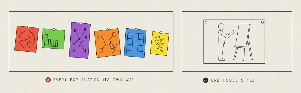
“I think we should have a house illustration style.”“I think we should have a house illustration style.”
We often have to explain a concept as part of the work — to a client, in a proposal, inside a piece we are publishing for them. Having a default style for it, the way IKEA has one, extends the identity into the documentation instead of leaving every explanation to look like whoever drew it.Explaining a concept is part of the work. A default style for it, the way IKEA has one, extends the identity into the documentation.

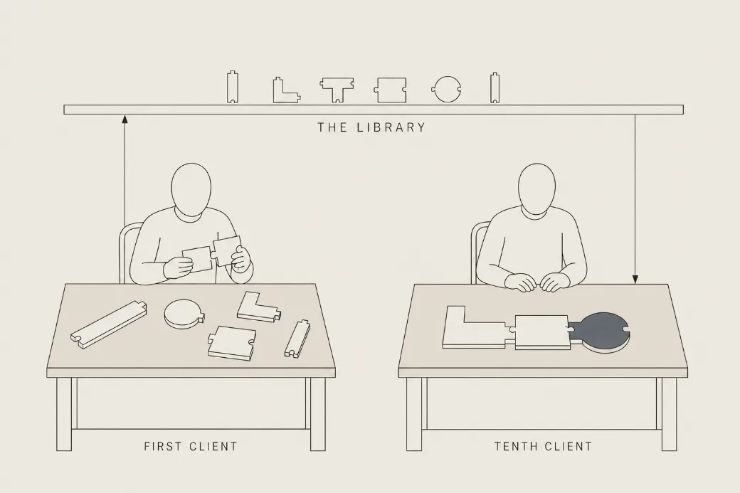
Every figure clears the same six before a pixel is spent, and the last one is the only one that matters: a diagram that needs its caption explained has not worked. The picture beside this list is one that passed — five loose units on the first client’s desk, three locked together on the tenth’s, and the library that made the difference.Every figure clears the same six before a pixel is spent, and the last one is the only one that matters: a diagram that needs its caption explained has not worked.
Most of this page is nothing.
That is the point.
Negative space means we leave the gaps alone. One subject to a surface: a sign, a slide, a proposal, an email. Nothing is added to fill a corner. When something has to come out, the space around what is left stays. A crowded page looks like effort, and we sell the opposite: one thing on one desk instead of ten. The calm is what lets the work speak.Negative space means we leave the gaps alone. One subject to a surface, and nothing added to fill a corner. The calm is what lets the work speak.